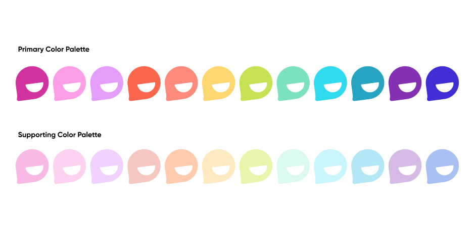
Color plays an important role in the identity. The palette is bright, fresh, and modern, and should be used with equal significance throughout the brand applications.
Overview
Gradients may be used throughout, but should be kept to two colors per mix. Colors selected for the gradients should be close in tone to ensure maximum vibrancy. Below are our approved selection of gradients. New, non-approved gradients are not to be created. (In other words, feel free to get creative on Flip, but NOT with our gradients.)

How to Apply/Use
A large variety of color combinations can be created using the primary and secondary color palettes. Keep in mind that the color combinations should have sufficient contrast. Please see the next page for the full list of approved color combinations.
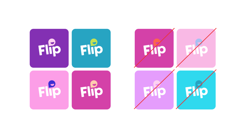
Here are our approved selection of color combinations with sufficient contrast.
New, non-approved combinations are not to be created.

© Microsoft 2022