Logo

Overview

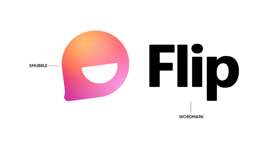
Our logo is composed of two distinct parts: the wordmark and the Smubble.


The logo appears as a full mark and as a Smubble only. The wordmark should never appear on its own without the Smubble. (#BetterTogether) See the following pages for usage on each.
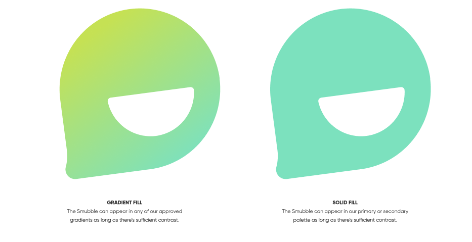
Flip Smubble


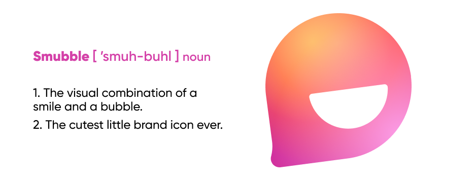
The Smubble can be used to create a pattern, as a container, or used on its own, but it should never act as a replacement for the logo. If it is a piece that could potentially be someone’s first experience with the brand, then it needs to also include the logo.


The smile must always be included as part of the Smubble and may be in white, grey, or the color of the background behind the Smubble. The Smubble should always be placed as shown, at an angle of 7.5°.

Examples of using the Smubble:

Check out our Canva Smubble template here!

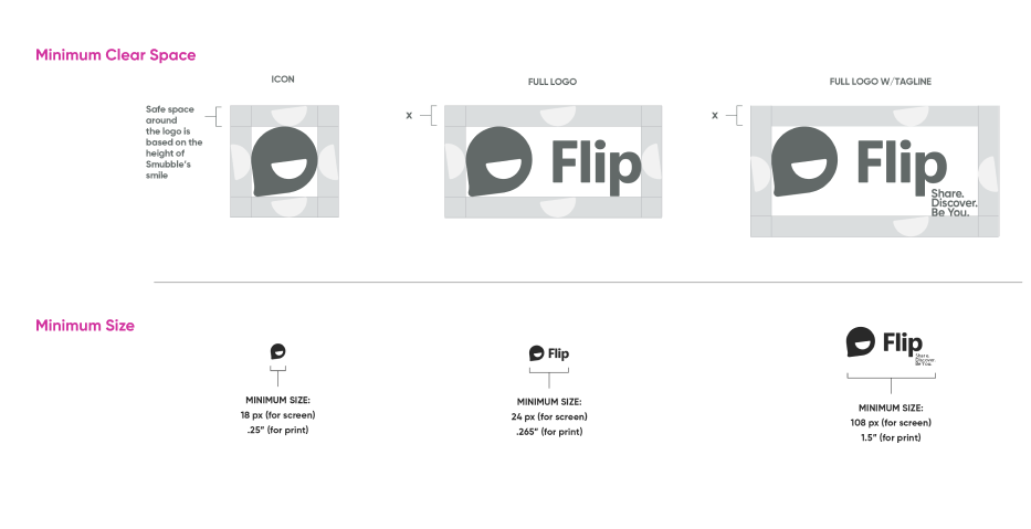
Space and Sizing

In order to give our logo the correct impact, ensure it’s surrounded by clear space and refer to this guide for minimum sizing. Elements around the logo should not detract from the brand. Please avoid altering the logos and only use the logo files provided.

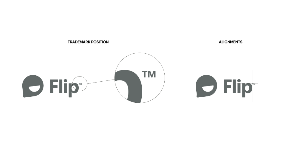
Trademark Symbol

The trademark symbol only needs to be included when the logo is used in circumstances outside the Flip world. For example, if we were to supply the logo to a partner or supplier.

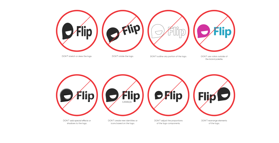
Some Don'ts

When using the logo, only use the supplied logo files and avoid tampering with or altering the lockups. We have created a set of guidelines to optimize the logo for all use cases.


Please don’t make us call the designer police…

Download the full guidelines here!